SAAS WEBSITE DESIGN · 2025
Magic Table
Interactive Dining Experience
Lead UI/UX Designer · Discovery to Handoff
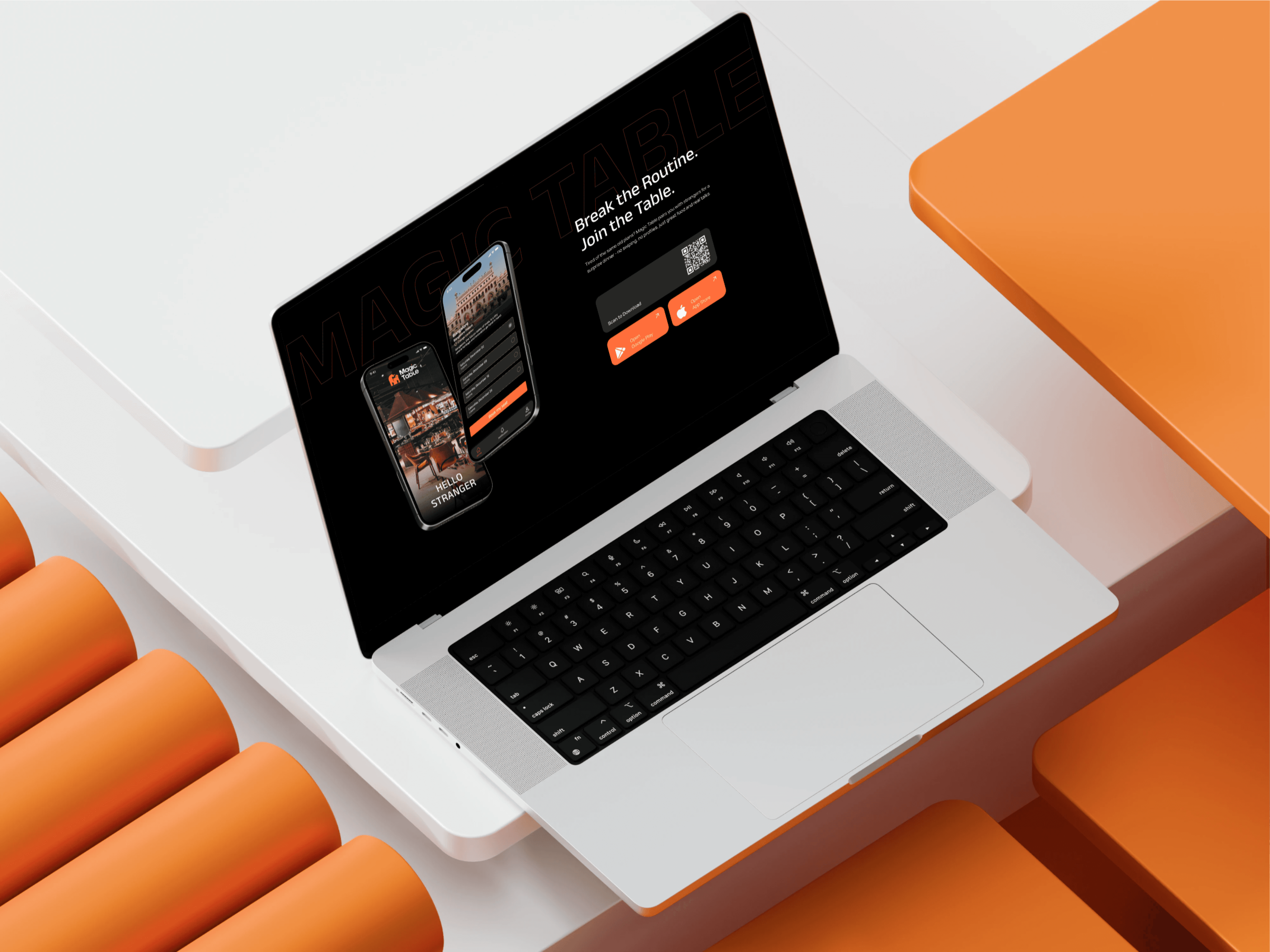
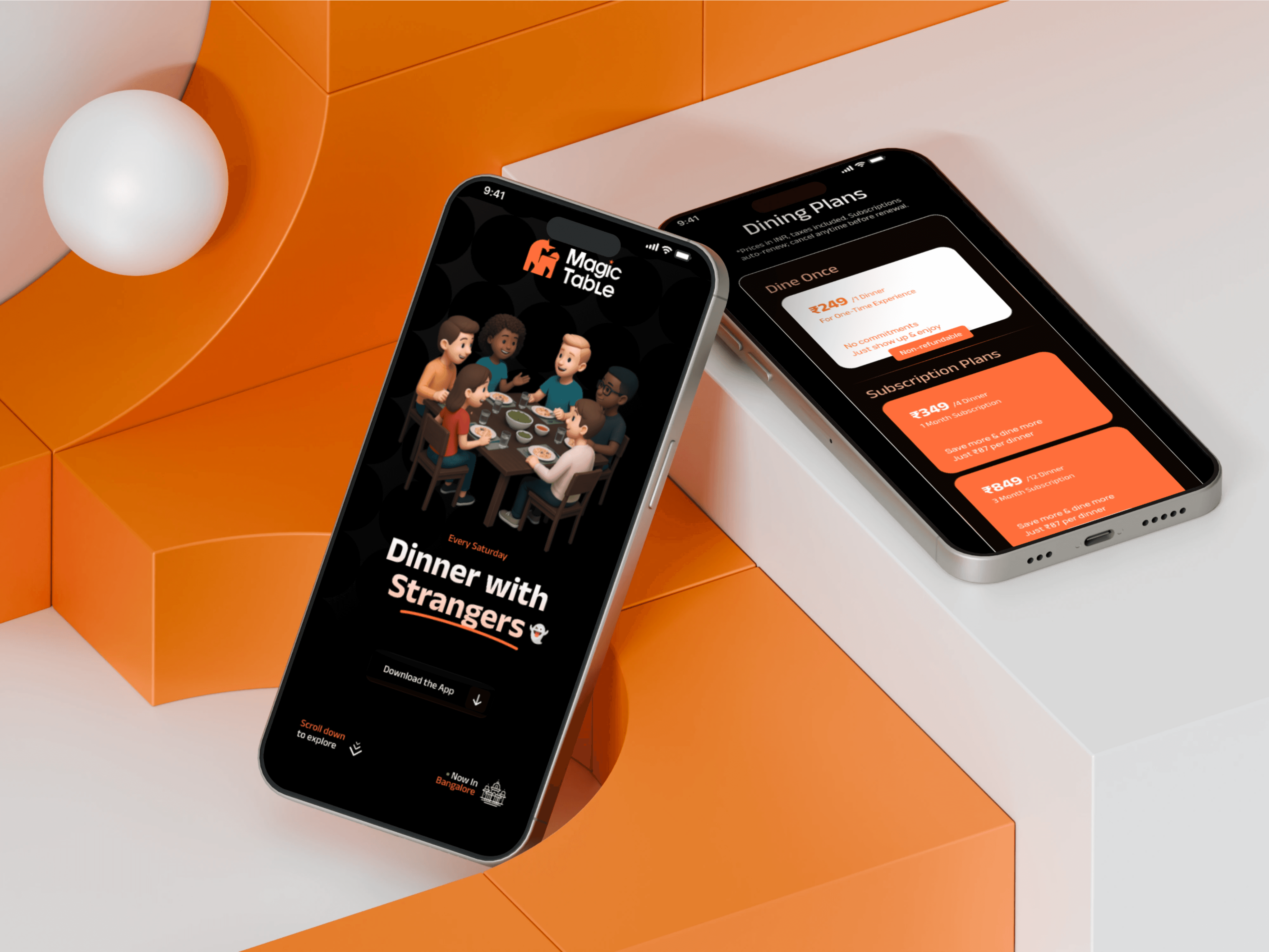
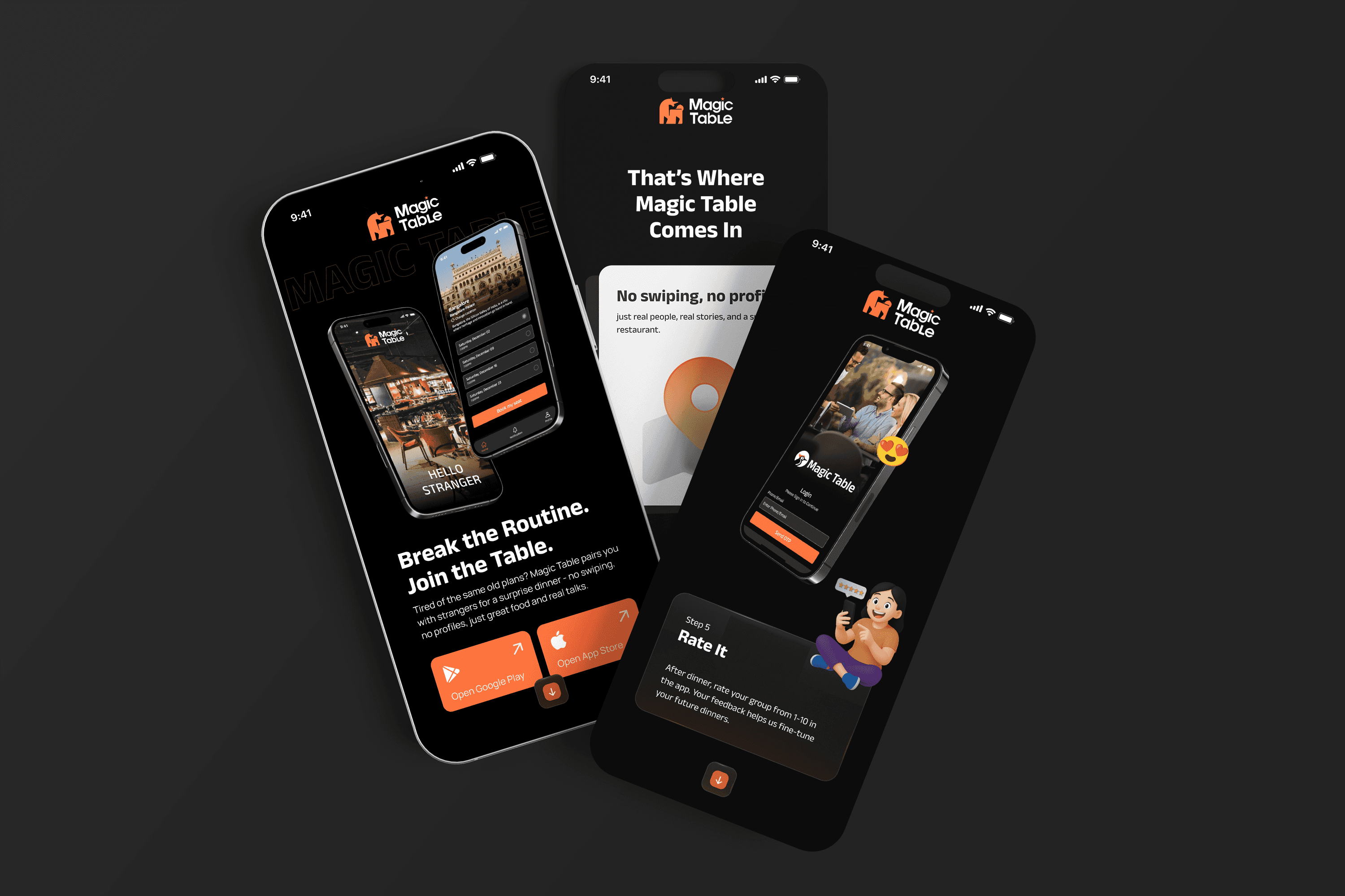
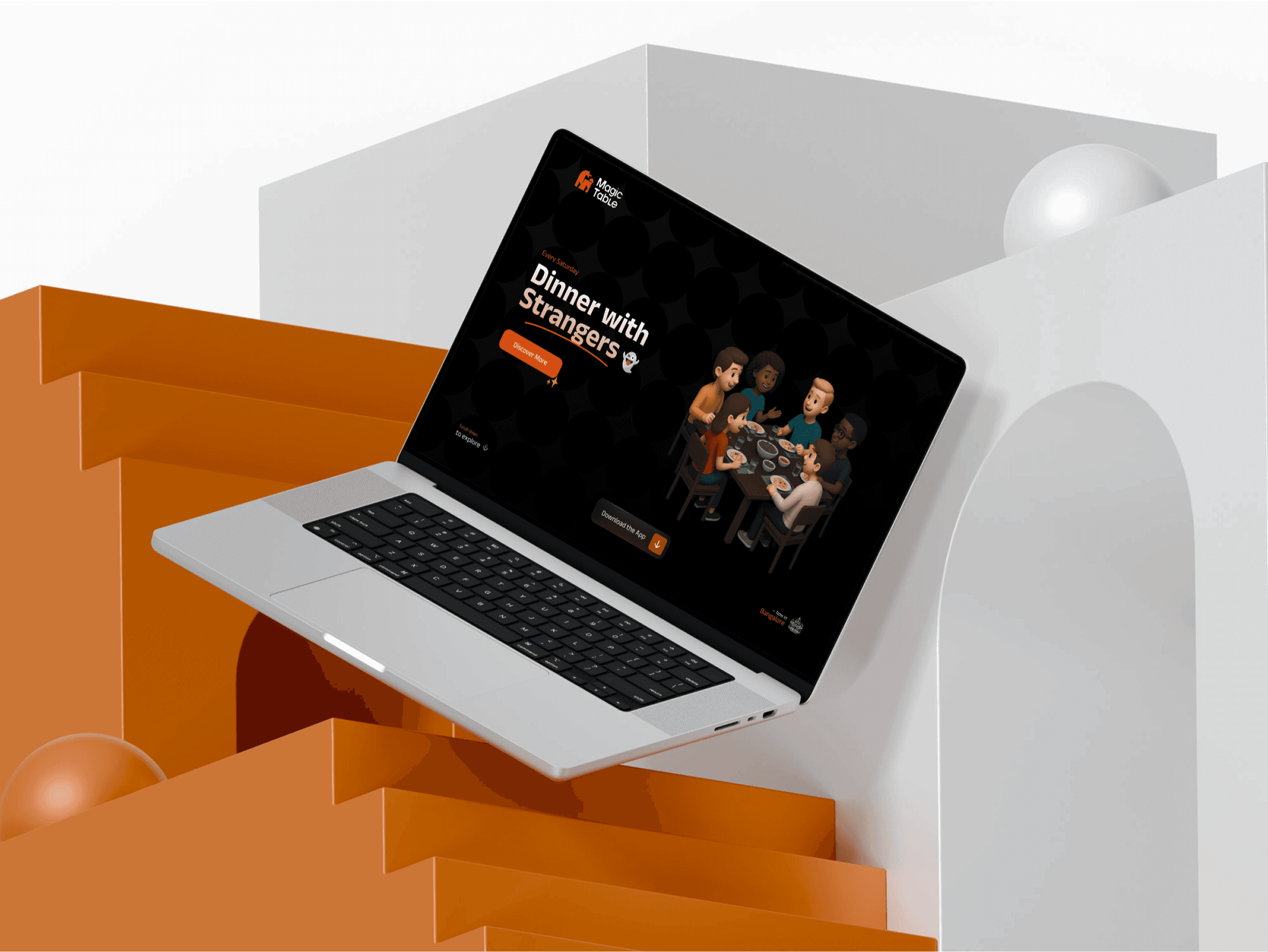
Magic Table is a curated dining app that brings strangers together over shared meals every Saturday. The idea is simple, the explanation wasn’t. My role was to design a single-page website that introduces the concept clearly, builds trust, and makes booking feel approachable instead of intimidating.
INTEGRA MAGNA · 8 WEEKS · FIGMA
The Challenge
People loved the idea of meeting new people offline. But when they visited the website, they were unsure: How does it work? Who else joins? What actually happens at the dinner?
The concept felt intriguing, but vague. That vagueness created hesitation. The problem wasn’t lack of interest. It was lack of clarity.
The task was to: • Explain the concept in under a minute • Reduce anxiety around meeting strangers • Make booking feel simple • Build trust without overwhelming users
View Live Website
Discovery Phase
Urban millennials and young professionals (25–40) • Open to new experiences • Tired of endless digital scrolling • Curious about meaningful offline connections
Core User Needs
Clarity: What is Magic Table? What actually happens at dinner? Trust: Who has attended before? Is this safe? Is it worth it? Ease: How quickly can I book? Is the process complicated?

User Strategy
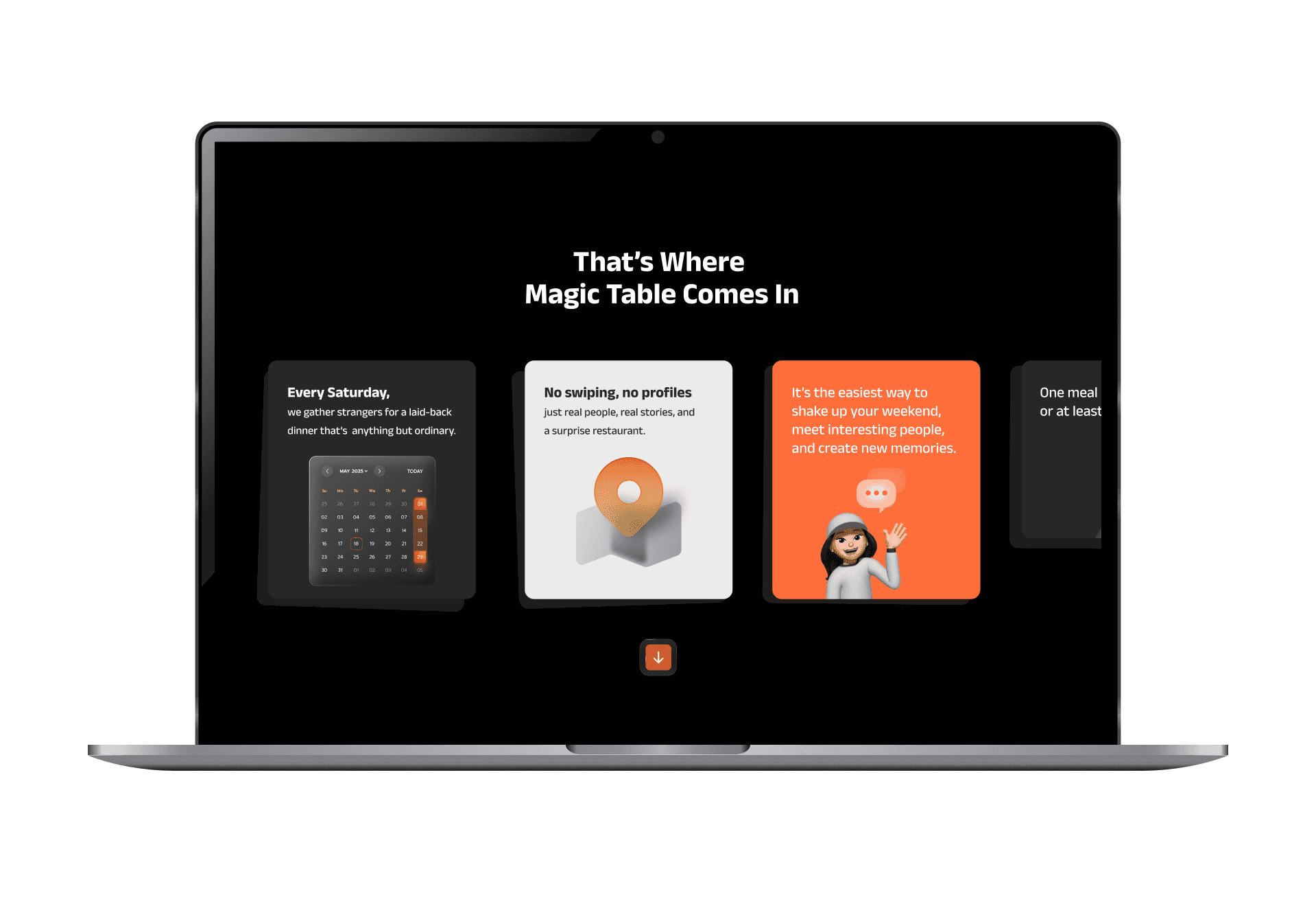
Hero & about → What is Magic Table? Visual storytelling → How it works Community proof → Who else is at the table? Rhythmic CTA → App Store / Explore Events
Instead of presenting information all at once, I structured the website as a guided story. Each section answers one question clearly before moving forward. The goal was rhythm, not density.
Users were intrigued by the idea of curated dining with strangers, but unsure how it actually worked. Vagueness created hesitation. The problem wasn’t convincing users. It was reducing uncertainty.
Trial and Errors
V1 → Too Abstract
The first version leaned heavily on text and colors. It looked blocky, and users still asked, “Okay, but what actually happens?” That told me storytelling needed structure.
V2 → Over Explained
I added detailed steps and explanations. Clarity improved, but the page felt long and heavy. The emotional spark was missing.
V3 → Structured Simplicity
Short sections. Clear headlines. Micro-interactions to maintain flow. Every scroll answers one doubt. The page balances emotion and visual with explanation.
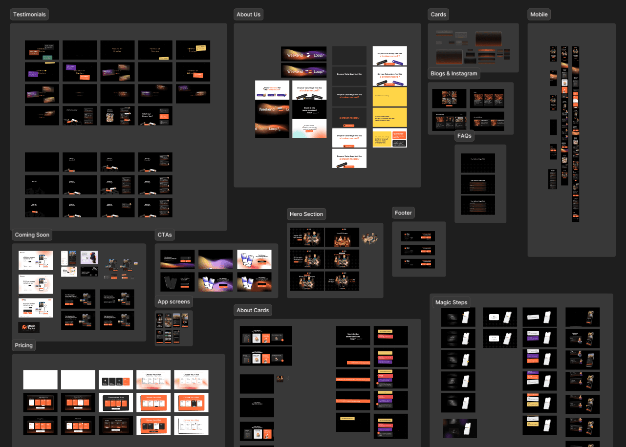
The Solution
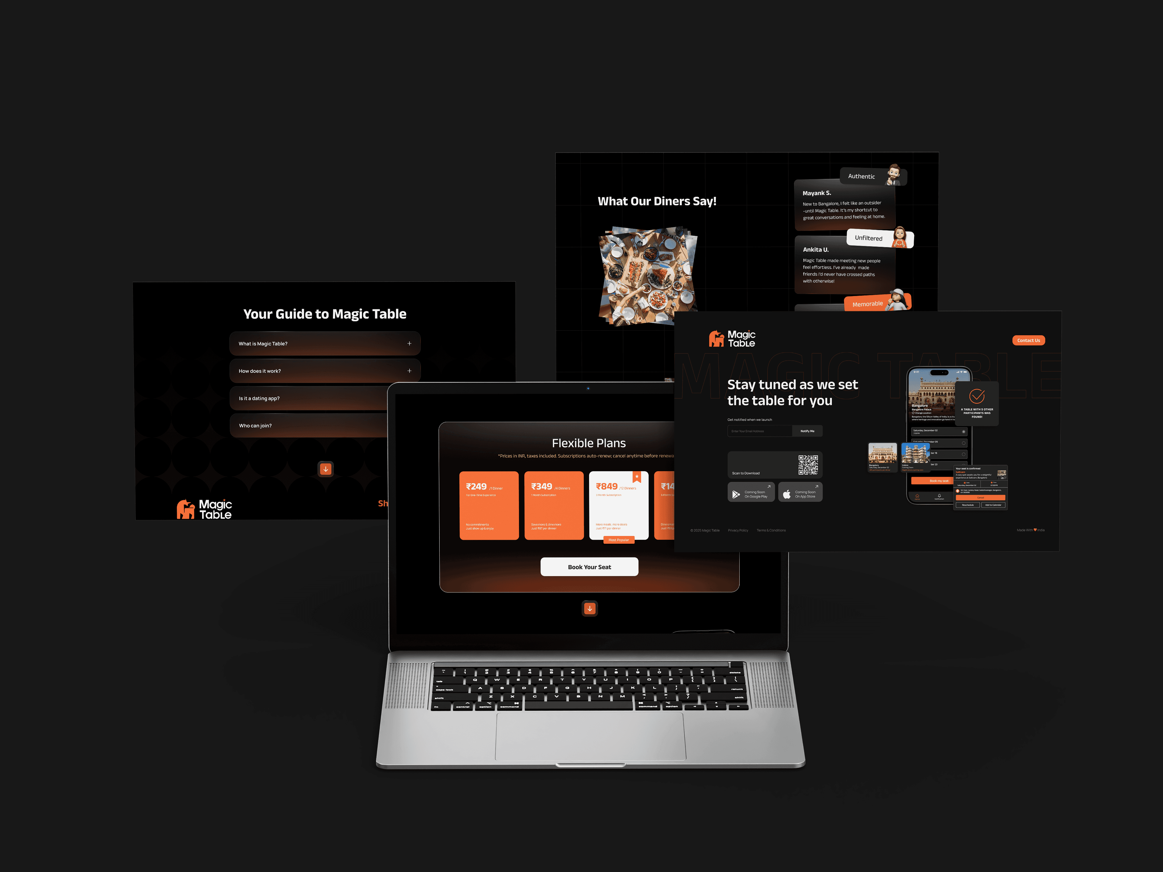
Single Page Interactive Experience No hidden navigation. No multi-page complexity. Just one clear journey.
A focused, scroll-based narrative that introduces:
• The concept• The booking flow• The community aspect• The value of offline conversations
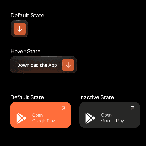
Trust-Building Through Design
Responsive-First Design


The real challenge was making something unfamiliar feel safe and inviting. I learned that when an idea is new, the website’s job isn’t to impress. It’s to remove doubt. This project strengthened my ability to: • Simplify abstract concepts • Design narrative-driven web experiences • Balance emotion with structure • Think responsively from the first wireframe — Closing Reflection
The Results
Users can understand: What Magic Table is How it works Why they should try it All within a single scroll journey. The experience feels modern, but human.
Users can understand: what Magic Table is, how it works, why they should try it All within a single scroll journey. The experience feels modern, but human.
What I Learned • Clarity matters more than cleverness • Emotional ideas need structured explanations • Responsive thinking should begin at wireframe stage • Iteration sharpens both content and interface
USER CURIOSITY
MOBILE CONVERSION

