INFORMATIONAL WEB PLATFORM · 2025
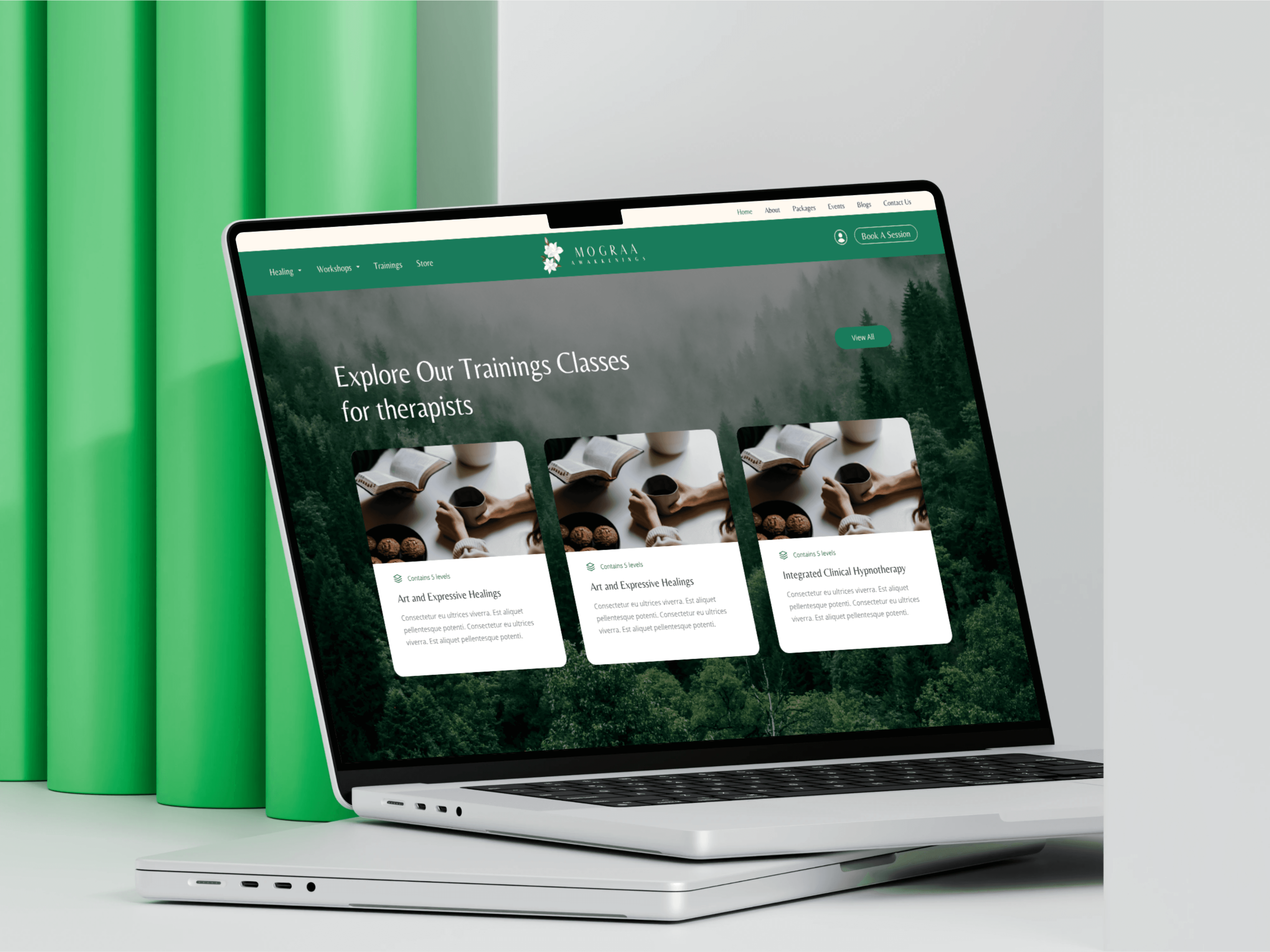
Mograa Awakenings
A mental health and wellness space led by trained psychotherapists
Lead UI/UX Designer · Discovery to Handoff
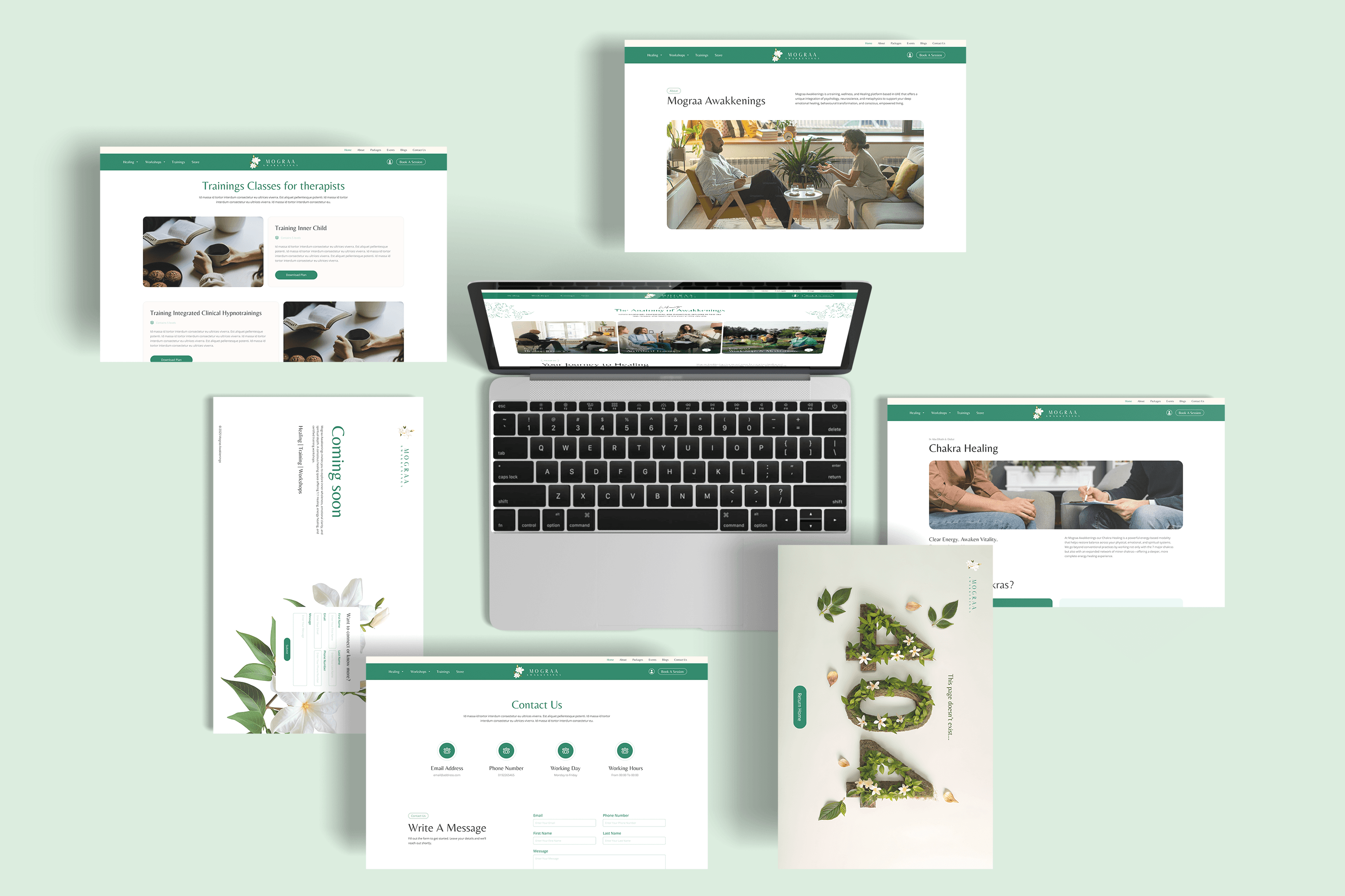
Mograa Awakenings is a mental health and wellness space offering therapy sessions, workshops, training programs, and a curated store. How do you present multiple sensitive services without overwhelming someone who may already feel emotionally vulnerable? This project focused on clarity, flow, and quiet trust.
INTEGRA MAGNA · 12 WEEKS · FIGMA

The Challenge
Mograa offers a wide range of services: • One-on-one therapy • Group sessions • Workshops • Certified training programs • A wellness store
Everything lives under one roof. The risk was information overload. Users visiting the site are often in a reflective or sensitive state. They need reassurance, not complexity.
The design needed to: • Organize diverse offerings clearly • Make booking simple • Maintain a calm emotional tone • Communicate professional credibility
View Live Website
Discovery Phase

• Individuals seeking therapy or healing sessions • Aspiring therapists exploring certified training • Participants interested in workshops or community events • Users looking for trusted mental health guidance
Core User Needs
Understanding: What does Mograa offer? How are services different? Simplicity: How do I book? Where do I start? Confidence: Are these professionals qualified? Is this space credible?
User Strategy
Each section has its own space, hierarchy, and depth. The navigation avoids dropdown complexity. It guides users step by step. The goal was to reduce decision fatigue. If someone comes looking for therapy, they should not have to scan through training content first.
Instead of layering services randomly, I structured the site around four clear pillars: • Therapy • Workshops • Training • Store


Therapy, workshops, training programs, and a store were presented under one umbrella without clear hierarchy. For a wellness platform, that creates overwhelm. Users seeking mental health support need clarity and steadiness. Not layered navigation and dense content blocks.
Trial and Errors
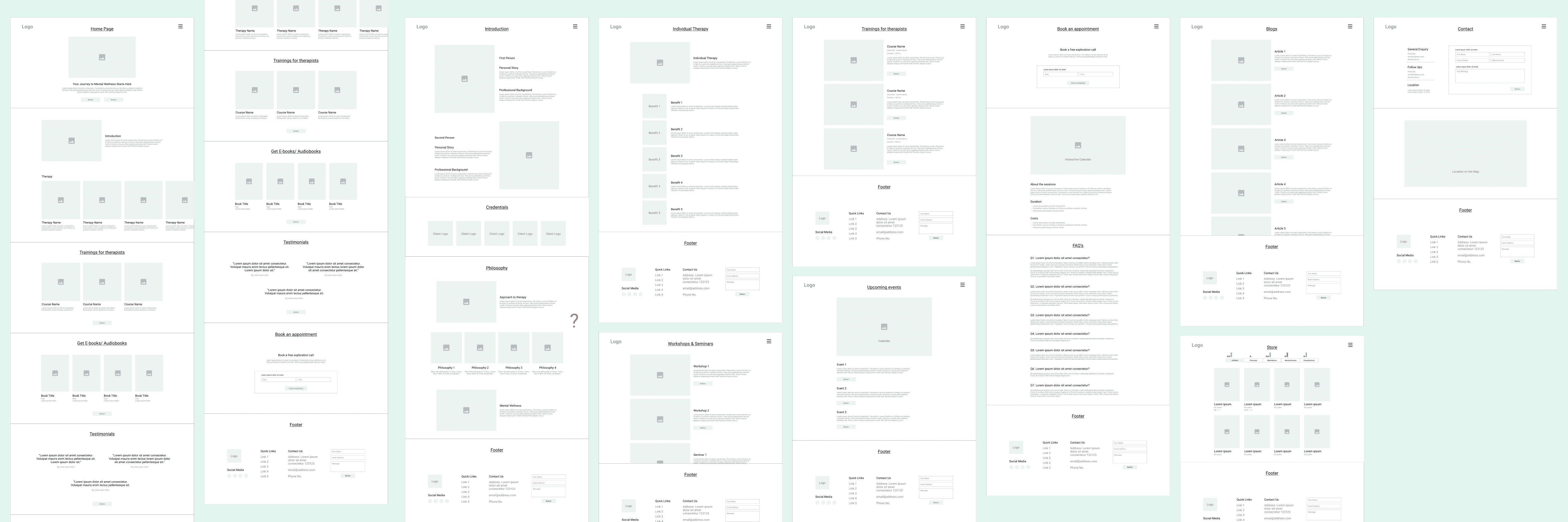
V1 → Everything Visible
The first wireframe tried to show all offerings on the homepage. It felt complete. But also heavy. Users had too many entry points at once.
V2 → Segmented Structure
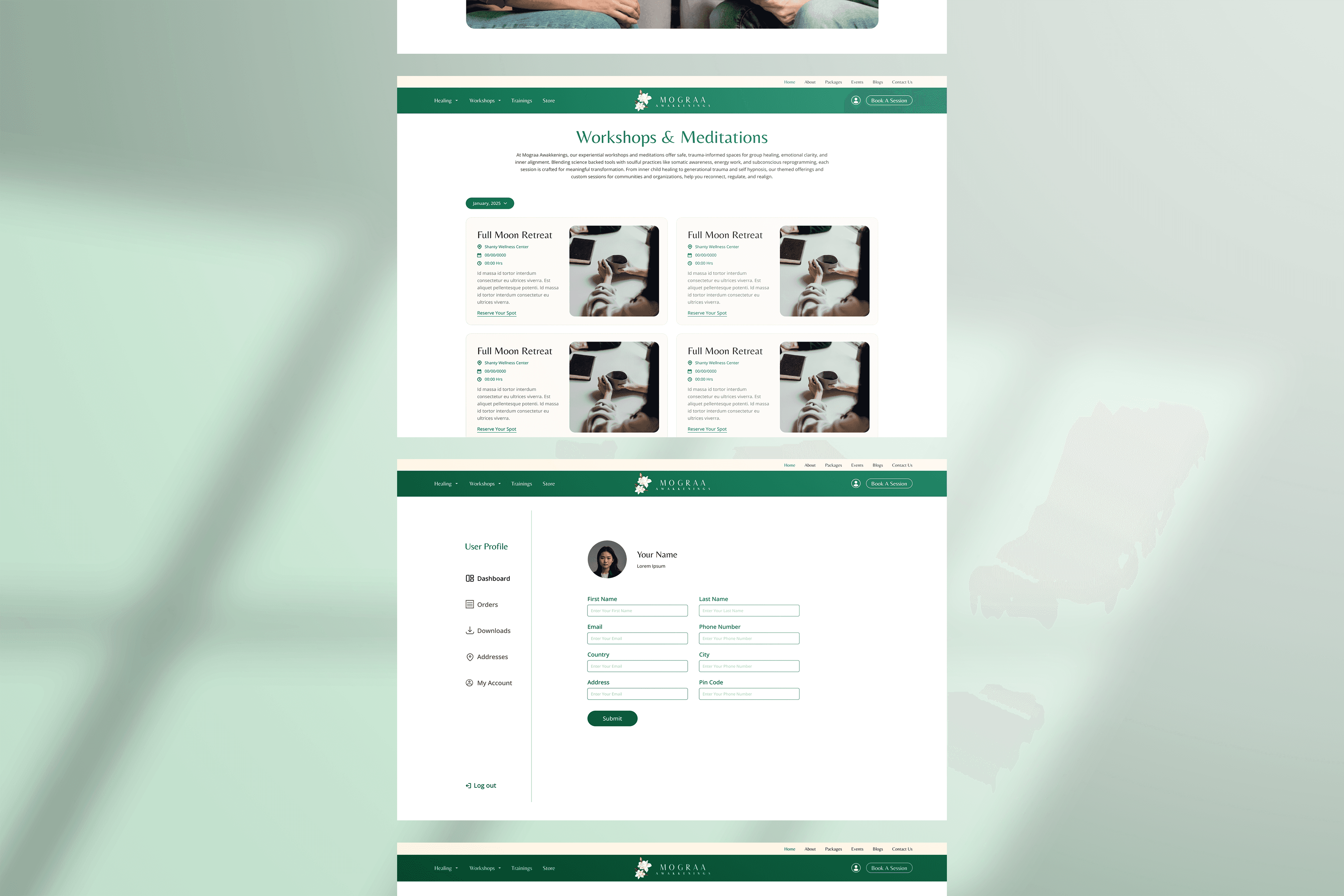
Services were divided clearly into dedicated sections. Visual breathing space increased. Booking CTAs were placed closer to relevant content. The experience shifted from information hub to guided exploration.
V3 → Final Direction
The final layout emphasizes: • Generous spacing • Clear section divisions • Minimal color shifts Instead of pushing users forward, the design allows them to move at their own pace.


The Solution
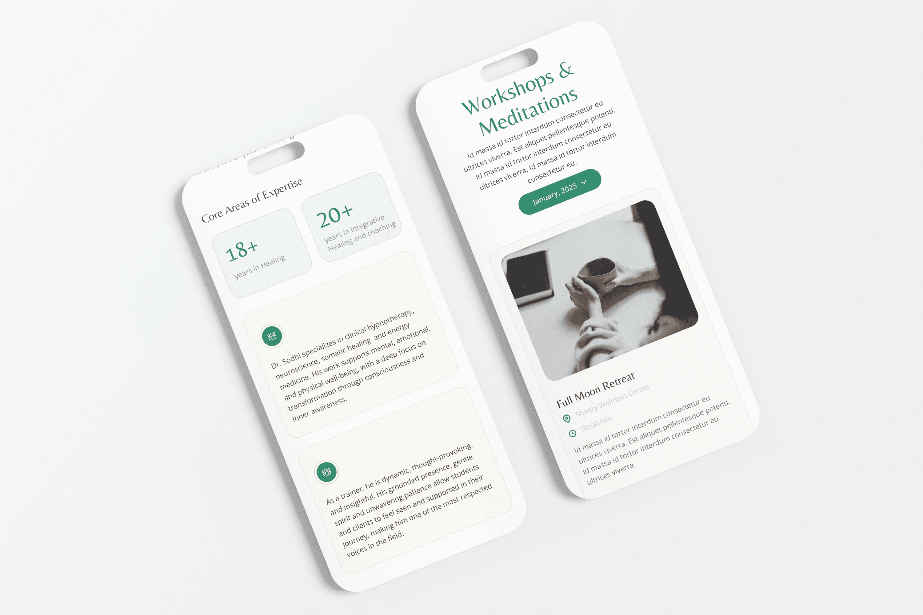
Each section follows a consistent internal structure: • Clear introduction • Who it is for • What to expect • Direct next step This reduces cognitive load and avoids decision fatigue.
Structured Information Architecture
Navigation was simplified to ensure users could move between services without confusion. The goal was guided exploration, not forced navigation.
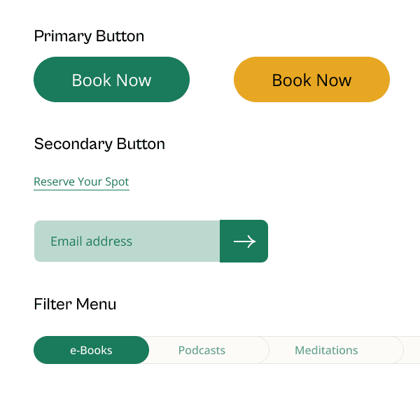
Calm Visual System
Responsive Design


"Mograa reinforced something important: when designing for mental health, restraint matters. Too much motion, too much contrast, too many choices: all of it increases friction." — Closing Reflection
The Results
The experience supports users who may already feel emotionally overwhelmed. Instead of competing for attention, the design creates space.
The final platform organizes complex offerings into a clear and approachable structure.
Users can: • Understand services quickly • Move between therapy, workshops, and training seamlessly • Book sessions without confusion
SERVICE DISCOVERY
DECISION FATIGUE